
Young's Home Page A/B Testing
Or how we learned to love A/B testing and increase click-through rates & decreased Drop-off by 38.04%.
Overview
Young's Hire Wear is an online & instore suit rental company, they provide suit hire for Debenham's through the UK. They offer a wide range of suits, from formal wear to highland wear. Everything can be done online, from customising your suit to trying it on at home and placing the final order for your event you never have to leave your desk.
The Problem
The current Young's homepage saw a lot of drop off and not many click-throughs. It felt cluttered and dated with no focus, too many call-to-actions and a lot of features that weren't used.
The Goal
We wanted to decrease drop off on the homepage as well as increasing click-through, to do that we wanted to pare down the current content and give more focus to the important CTA's.
The Results
- • We achieved a 38.04% reduction in site-wide bounce rate (34.40% vs 55.52%) by a methodical testing programme on homepage, tux builder, tux summary, quick-try-on, and mobile pages.
- • Analysis of the customer journey and subsequent design optimisation increased user conversion to Try-On or Order from:
- 1.68% at launch in 2016
- To 2.97% in 2017 = 149.37% increase in conversion
- To 4.86% for 2018 Year-To-Date = 179.75% increase in conversion
What we did
We decided the best form of user testing would be to conduct an A/B test on the homepage over a period of a month and see if a reworked homepage would increase conversions. We used the analytics data to ascertain the key paths our customers took, of all the click-throughs on the homepage the majority were "Free Home Try On" with "View the Collection" and "Groom goes free" 2nd and 3rd respectively. Data indicated that those would be our key CTA's.
Other key updates came in form of updated imagery to promote new collections as well as a prominent customer testimonial section to discover if reviews would help conversion.
Designs
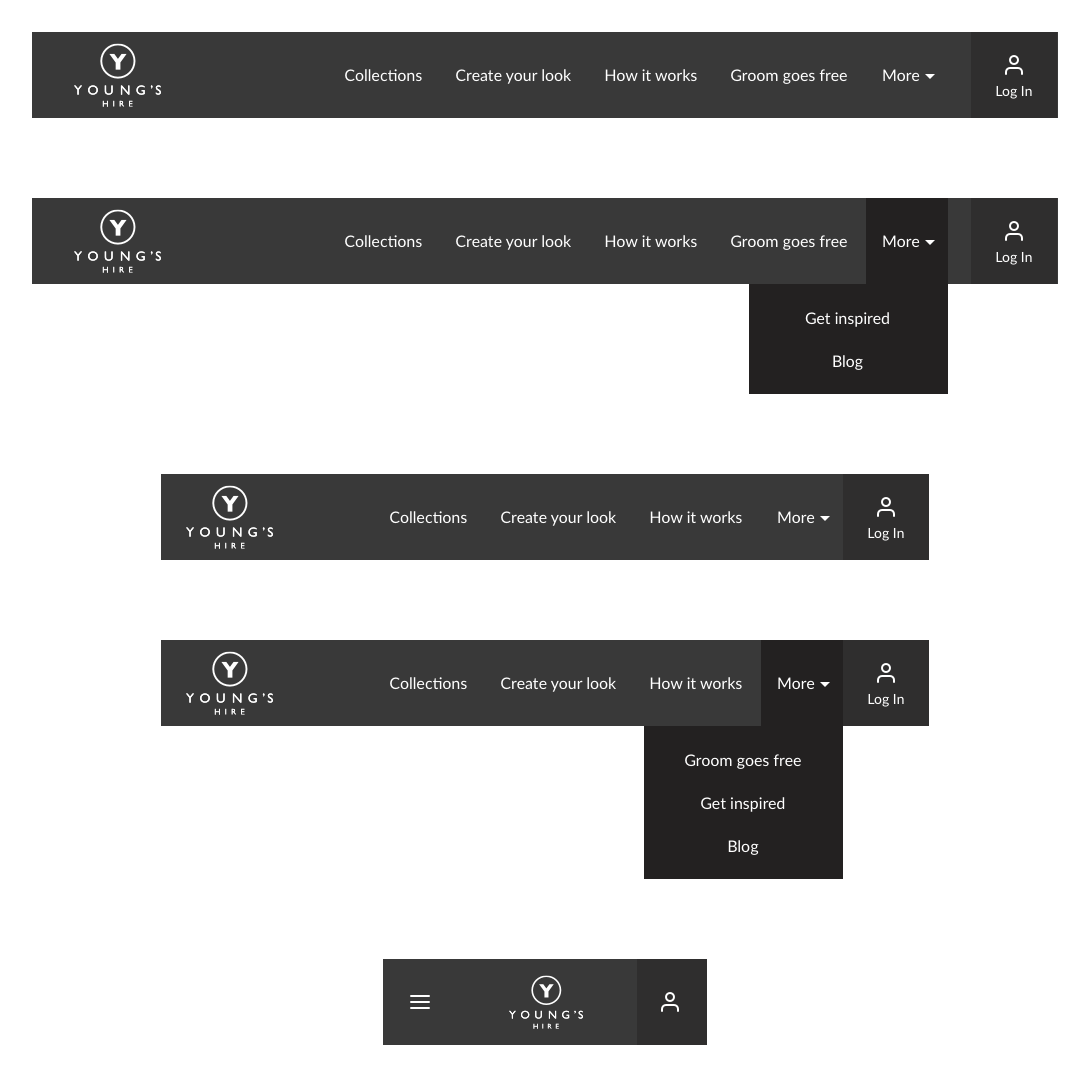
These are the designs for a more compact navigation section consisting of the key sections of the site which gracefully breaks down.
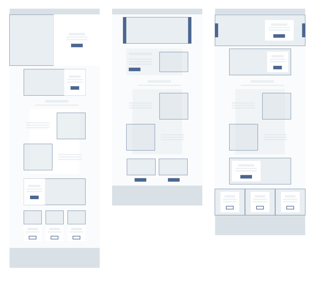
These wireframes examine optional layout ideas, from the most stripped down page to a heavy focus on imagery.
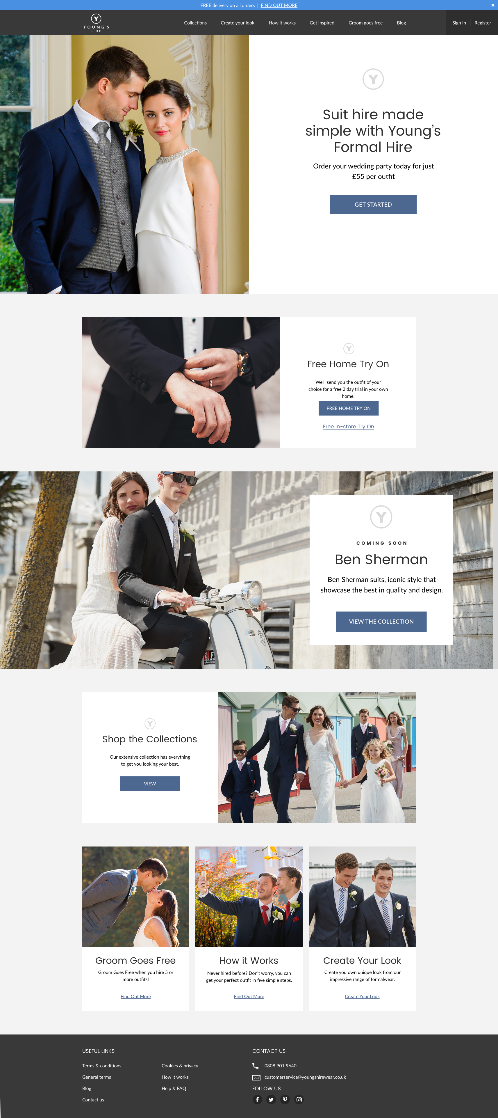
This is the final chosen design. It includes a compact navigation, a stronger tyopgraphical hierarchy and primary & secondary CTA's (giving focus to key routes)