smarts Brand ideation
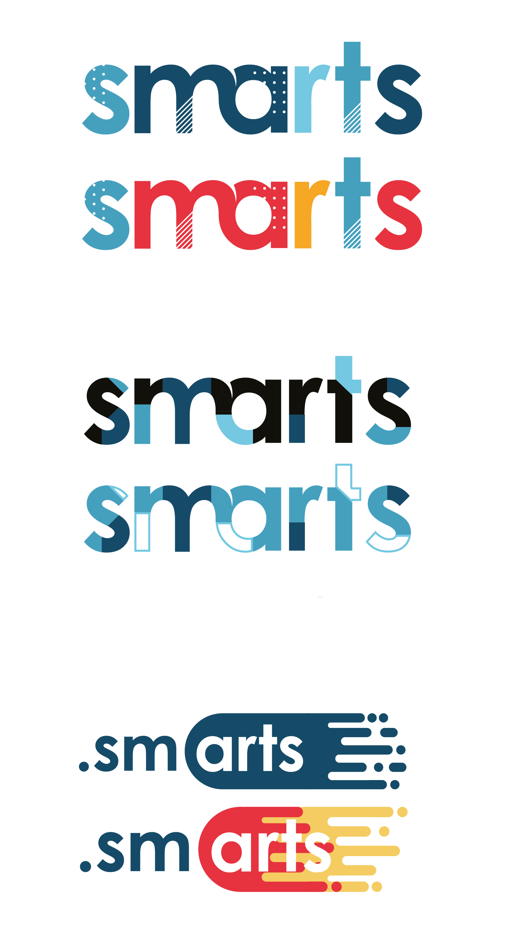
I was responsible for creating concepts for the new brand “SMARTS”. A new communication toolkit solution being developed at G2G3.
The logo itself needed to work as a suffix to other titles e.g. DevOps.Smarts or Service Management.Smarts. For that reason the logo needed to be minimal in any flourishes, Any flourishes it did have would have to be on the right side of the mark.
The client wanted to make a point of having ‘arts’ in the name so wanted there to be a visible break in the logo.
To the left are some of the concepts I worked up. One of main aspects of the product that I wanted to visualise was the ‘build your own bundle’ model. I did this via colours & textures.
